Tuesday, May 14, 2013
2000 Topps Series 2
Here's another pack I snagged at a card show recently. I barely have any 2000 Topps cards and have never so much as seen a pack of the stuff on a shelf before. This wasn't really on a shelf, either. It was buried in a pile of dusty junk on a table in a well-past-its-prime mall. And now you get to open it, virtually.
371 - John Thomson - This isn't a bad design, to be honest. Of course, in the days leading up to the year 2000, everyone was in love with saying the number "2000" an awful lot, but the "Topps 2000" designation now looks sort of quaint.
437 - Ron Coomer - In the past 10 years, Topps has used a non-white border design exactly one time, and it was boring old greasy fingers-attractin' black. Topps base cards continue to be the most disappointing thing to me about my return to collecting, so it's nice to go back to a time when they seemed to at least be trying some things.
409 - Dave Mlicki
316 - Ruben Mateo - I'm sure this upset the Topps purists, but this is a seriously nice looking card back, complete with a completely different photo of the player. Aside from this set, you have to go all the way back to 1993 to find cards with a portrait-oriented reverse.
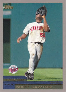
262 - Matt Lawton
465 - Randy Johnson / Pedro Martinez League Leaders - Here's the first problem I've seen. These foilboard two-in-one cards look dated and kind of terrible. I've probably passed over quite a few of these cards that I actually needed in nickel and dime bins because I never bothered to notice someone I collect on the reverse.
429 - Randy Velarde
444 - Julio Zuleta / Dernell Stenson / Jorge Toca Prospects - These fine fellows have a grand total of 141 games logged between them.
414 - Ron Belliard
439 - Tony Batista - Okay, enough about the design. Playerwise, this pack flat out sucked, aside from the League Leaders thing.
329 - Ray Durham - Not even Ray Durham can help.
Subscribe to:
Post Comments (Atom)


1 comment:
My problem with the portrait-oriented reverse is that you cannot see the card number if your set is stored in a box. It does look good in a binder, but if I am putting together a set in a box it is very annoying. Plus, gray is not a good look for a baseball card. Overall, I think this is one of the worst flagship sets ever.
Post a Comment