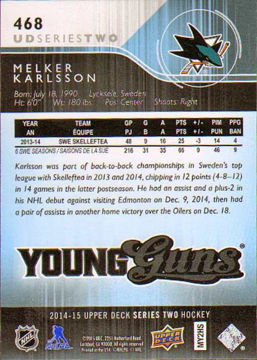
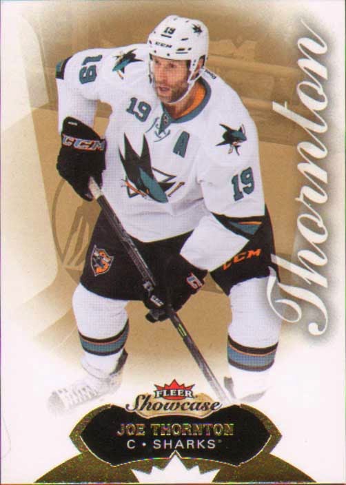
It's nice to see that Upper Deck can still put out a quality product. I wish I was more into hockey because I'd love to be putting together Upper Deck base sets again. Same layout at Series 1. I love the no border full bleed cards.
This card freaked me out a little.
No auto or relic in the pack, but I did snag a great Young Guns. These fall about 1:4 or 6 per hobby box.
Tuesday, March 31, 2015
Friday, March 27, 2015
2014-15 Fleer Showcase Hockey
Written by
cynicalbuddha
at
3:59 PM
While I'm not a big hockey fan, I couldn't resist picking up a pack of this year's Showcase. Don's card shop had a couple hits on display and they were pretty sweet. Sadly I didn't hit anything. Not pictured is the huge decoy that was alongside the 5 cards.
I did get one insert, this sweet Metal Universe.
I did get one insert, this sweet Metal Universe.
Thursday, March 26, 2015
2014 Topps Stadium Club Baseball
Written by
cynicalbuddha
at
11:11 AM
While on my last visit to Don's this weekend I picked up a bunch of different packs to share. Don had a couple boxes of Stadium Club on his bargain shelf for $2 a pack. How much did this originally go for? I can't remember. I might have to go back and see there are anymore left and see if I can snag an auto, even if the auto list is pretty thin.
First up my man, Robin Yount. Oh yeah, you know this going to be a good pack when your first card is your favorite player of all time!
It's a shame Topps didn't release this at a lower price point it probably would have sold very well. Great looking cards, I love that most of the base card is photo.
I also got this bad boy in the pack. While I'm not a big fan of the team or the player I really do like this insert set. If you haven't seen one of these Luminous cards in hand they are great.
Monday, March 23, 2015
2015 Donruss Baseball
Written by
cynicalbuddha
at
11:15 AM
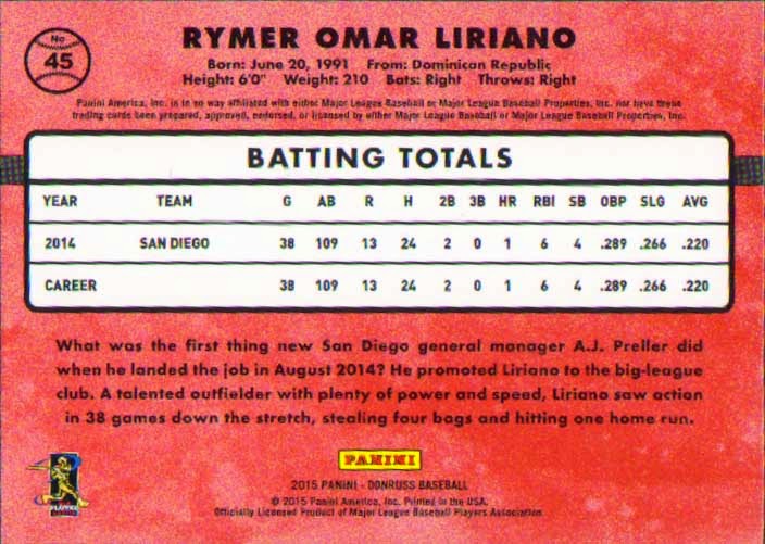
Finally got my first taste of this year's Donruss baseball. Picked a few packs up from Don's here in Anchorage.
This year's design is a hybrid of 87 and 85. Panini already used the 87 baseball bar last year, but this year moved it vertical and added those horizontal lines similar to the 1985 release. And this design was already used for it's Donruss Basketball release. I guess we can assume if they decide to put out a Donruss Football it'll used the same design except with little footballs in the bars.
Lets see what I got.
From the 3 packs that I opened it appears you get 3 inserts,SP's, or parallels per pack.
First up we have a Rated Rookie.
The one problem I have is it looks like the players are playing for teams based on color. Like Ichiro here now with the Marlins playing for the Black team
Patrick here is on the Red team
We get a Black Team Hall of Famer Frank Robinson
All on the Black team is the Panda.
Man there are a lot of Black team cards in this pack. Rounding out the base cards is Danny Santana.
All funning aside about the base cards, I do like that Panini has been bring back old Donruss brands as insert sets. Here he have Buster Posey's Donruss Preferred insert card.
I also lucked out and pulled an auto. These scan terribly and you might be able to make out the name Matt Barnes on the card. He too plays of the Black team, I mean Red Sox.
Over all a fun pack to break. I really like the brand and it goes with out saying these cards would be so much better if Panini didn't have to alter colors and airbrush out logos.
Sunday, March 22, 2015
2013-14 Panini Contenders hockey
As I mentioned yesterday, here is the last release of the Contenders product before UD went exclusive with the NHL cards.
As you see, they dropped the "Playoff" part of the name. Also, this is a far easier pack to read. No player on the cover. The boxes have a range of NHL young stars and rookies on it. Same five cards as yesterday.
As I said yesterday, we see the same basic design, a ticket with the player. This time we get the recycled image on the front. And I wish that was the only time it was recycled. But you have the stub style of the card. The duel image wouldn't be so bad if they had two different photos. I think between yesterday's post and today, this is the weaker design.
ALRIGHT! Now we are talking good cardboard. Dig that bent corner at the lower left of the ticket.
About the only advantage of the B/W image is you can see where the player is looking. Because, all these years I have thought "man, what is the player looking at?"
Foil city. This is a hard card to scan and view. It actually looks nice in hand, as you can see the numbering on the front. Too bad Lucic is such a dick.
Finishing off with this Suter. The middle of the card is a subtle advertisement for the company with the naming rights to each arena. Turning over.
Yup - #3 on the image. There was so much potential with this set, and it missed the mark. Not a good way to end the run of a set. Just the biography and the huge team badge. Panini just phoned this in the get what they could before the license was over. Here's hoping for a cheap box price come Black Friday.
Saturday, March 21, 2015
2010-11 Panini Playoff Contenders
Let's get back to the scan folder, as I have a lot more packs to scan. I really should just take a month and hijack this blog to clean the thing out. Anyway, there is less than a month remaining in the NHL season as teams jockey for playoff position. Here's an old pack that I think I pulled from a hockey repack box.
Tough wrapper to read, at least from the scan. This is a set that doesn't change too much from year to year, at least with the "idea" of the design. I actually like this set a lot and need to decide what year I am putting together. In fact, I have last year's pack scanned - we'll post that tomorrow. But back to the wrapper - Ovechkin on the cover. Washington needs to get rid of this crappy Reebok template and get a better design. It's a mess. Five cards to show - let's get to it.
I really like the whole ticket design. Yeah, it takes up a lot of real estate on the card, but it's a fun look. Having the player cross in front of the stub is a great feature. Hate the BFBS sweater on Stamkos.
Still shocked the Pens dropped this throwback, though what they brought in it's place is pretty sweet. Though, why they keep avoiding the fat penguin is beyond me. Johnson retired the following season of this card.
I'm sure plenty of Devils fans hate this card, and rightfully so. Kovalchuk is still having some good seasons in the KHL after "retiring" at the rope old age of 30. And not to beat a dead horse, but tell me which looks better - this sweater or this one.
Insert alert. Decent design, but who in the hell is John-Michael Liles and what makes you think he can win the Norris? Guess you gotta fill the sub set with someone, huh?
Lastly is this Kopitar. If I had any complaint about the design, it's the conference logo. But I guess a logo is better than a word mark.
Image reused (of course). Zero stats!!! You get the personal numbers of the player, and a shot bio. But not a goal or assist to be found. Not sure how I feel about that.
Subscribe to:
Comments (Atom)


