Tuesday, May 30, 2017

1995 Fleer Ultra ReBoot

Another pack from the Dollar Tree feeder. The card gods gave me a pack of Fleer Ultra ReBoot from 1995. Well, they didn't give it to me. I had to buy it. Darn card gods. Especially since I gave them a burnt offering of 1989 Donruss. The local fire department wasn't too keen on it either.


ReBoot was a cartoon from Canada.  Good guys try to keep the Mainframe computer safe from bad guys.  Pretty sleek for 1994.


I watched in the late 90s with my son.

Below is Dot Matrix.  A good guy.  Or gal.  Gal.  With greenish hued skin.

Megabyte.  A bad guy.

Hexidecimal.  Another bad guy.  Or gal.

Matrix.  Enzo Matrix.  Dot's brother.  A good guy.  Or guy who dresses like a gal.
More Megabyte.  More badness.

Even more Megabyte.
I think that the premise and characters did a lot to confuse my son.  The cards confuse me.  I get that Fleer Ultra was hip in the mid 90s.  But to sell out for a lousy kids show tie-in?  They just lost their cool status.

For more on the show, visit the Wikipedia entry.  For more cards in this product, visit COMC.

If you'd like some sort of digital sorbet to cleanse your mind, visit this relaxing video.

Saturday, May 27, 2017

1985 Topps 3-D Baseball Stars


I found this listing while looking for something else (isn't that how the Internet works?) and couldn't resist grabbing a couple packs. The wrapper is paper.

The card inside (1 per pack) is about 4"x6" and is plastic. It's a molded 3-d "card" or "photo" of the featured player, and it is sheer 80's awesomeness! The card shows the player's name in a red banner across the top. Under that, in a black banner, is the Topps logo and the card number. There are 30 cards in the set. The rest of the card/photo is a molded 3-d image of the player. It is freaky and amazing all at the same time.


It's hard to tell the 3-D effect from a head-on shot, so I took a picture from a different angle:


Really, though, pictures do not do these things justice. They are 3-d in multiple levels of 3-d. That is, the bat is flat at the top, since it is away from you, and pulls out further away from the card near the bottom. The nose sticks out a little further. The jersey FEELS real with the raised effect waving along where there are wrinkles and ripples. It is quite cool.

The back is blank, but has two bits of adhesive so you could stick the photo... somewhere... No idea what you would stick a 3-d photo on, but it's there just the same.


In addition to Hernandez, I ended up with a card of Dave Kingman:


The back of the wrapper features the checklist:


These are great! At least Kingman didn't pull a Billy Ripken...

Friday, May 26, 2017

1978 O-Pee-Chee Baseball


Back when Topps had a monopoly on baseball cards (no, not in the 2000's, but the FIRST time...), they at least would license their products to companies like O-Pee-Chee. These are 1978 O-Pee-Chee cards from Canada. The set only had 242 cards, mostly focused on Blue Jays and Expos players or ex-players. It used the same design and pictures from the Topps 1978 offering. These featured a white border around the card. Images take up the majority of the real estate, thankfully, surrounded by a colored thin border. In the top corner (usually on the right), a baseball design with the player's position. At the bottom, the team name in a script font my brother and I used to refer to as "The Written Kind" when we were kids (and, evidently, too dumb to look at the date on the back in order to differentiate which Topps sets we were talking about). The player's name is typed in all caps in the lower side opposite the team name.  Man, I loved this set as a kid.


The backs of the cards were printed on a much brighter cardstock than the regular 1978 Topps. At least, in my estimation. The backs feature bio info, stats, a tidbit about the player, and a game that could be played by two collectors - all written in English with a French version underneath! The gum you see is absolutely stuck to the poor Jerry Garvin card.


You can pick these up much cheaper than their Topps counterparts, plus they make a cool addition to any collection. If you have youngsters getting into collecting, they should find these bits of cardboard quite entertaining.

Thursday, May 25, 2017

2017 Topps Star Wars 40th Anniversary Retail

Greetings!

Need I type more?


OK, I guess I do since this is a card post.  It's a pack of 2017 Topps Star Wars 40th Anniversary!

Topps has released a card set to celebrate the 40th anniversary of the release of Star Wars.  You can see the checklist here.

I bought 2 packs from the Target gravity feeder box over the past week ($2 for 6 cards) with the intent of posting the contents of both of them, but Sand People came and took one of them...or it's lost in the piles of cards in the office. Below are the contents of the second pack:

#25 - Star Wars:  A New Hope - Darth Vader Vs. Obi-Wan Kenobi
#13 - Star Wars:  The Clone Wars Season 4

The border and titles are alright, but a little much.  I wouldn't have minded more room for the picture.

The cards cover the film and television releases and major moments in the franchise up to this point, as well as artwork, memorabilia, and impact on the entertainment industry.  Not everything is covered - the Cartoon Network Clone Wars series and, for better or worse, the Star Wars Holiday Special is missing, for example...perhaps anything not owned or acknowledged by Disney.


#10 - Star Wars:  The Clone Wars Season 1 (Blue parallel)
#164 - Rogue Squadron Air Show

It wouldn't be a modern card set without the different levels of parallels.  I believe the blue parallels come in every pack. It looks nice, just a little too much.

The Airshow card is part of their "Licensed Products" subset.  These lesser known aspects are what makes the set for me; the movie and moments cards are nice, but there are card sets for them.


#101 - Spanish Star Wars Poster (Style C)
#120 - Retail Star Wars Poster

The last two cards in the pack are from the "Star Wars Posters" subset.  More examples of the uniqueness of this set.

Here are the backs; I included the 3 subset cards - notice the brief mention of the other Clone Wars series in the Clone Wars Season 1 card:


That's the pack.  Based on the cards I picked up, this isn't a waste of money, like other Star Wars sets. Happy birthday Star Wars...thanks for the 40 years of entertainment!

Thanks for reading!

Tuesday, May 23, 2017

1979 O-Pee-Chee Moonraker


Sad news today as the man I knew as James Bond, Roger Moore, has died at age 89.

There have been endless arguments as to who the "real James Bond" is, and I'm not here to discuss that. I grew up during the 1970 and 1980s and the Bond films that I first knew were "The Spy Who Loved Me," "Moonraker," "For Your Eyes Only," "Octopussy," and "A View To A Kill," all of which starred Moore.

Moore's Bond movies were less serious than previous Bond films and some would argue they were "too campy," none more so than "Moonraker". (There is a boat chase scene in Venice in which a pigeon does a double-take).

"Moonraker" is the first Bond movie for which I saw advertisements or spotted listed on the theater marquee. I wanted to go to "Moonraker," but never did. And I've never been much of a Bond follower.

But I do have this pack of Moonraker O-Pee-Chee cards to open for you!

It was sent to me by Angus several months ago. Seems like a good time to reveal the contents.


#61 - Bond and Holly on the run!

I have only cursory knowledge of the movie plot, so there won't be a lot of fanboy detail here. I do know that's Bond and Dr. Holly Goodhead (Lois Chiles).


#48 - Mysterious hideouts!

There is Moore's Bond taking a stroll, to track down the evil Hugo Drax in one of his many secret hiding spots.

The cards feature either a puzzle piece or short description of what's taking place on the front. An example of each:


Whoops, I think the puzzle is part of Bond's leg in a space suit and the card is sideways.


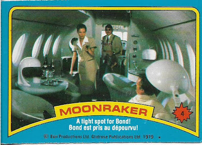
#4 - A tight spot for Bond!

This is at the start of film in which Bond is attacked on small plane and pushed out of it by Jaws, the big, scary metal-toothed mercenary who fascinated me as I saw the commercials for the movie. Also, the woman pictured is Corinne Dufour, Drax's personal pilot. She is later killed by wild Dobermans, which is pretty grisly for a Bond film.


#39 - Holly captured by Drax!

Another card of the lovely Goodhead (and unlovely Drax). She wouldn't be a Bond heroine without a suggestive name.


#43 - Director of "Q" branch

"Q" is the gentleman who devised all the crazy weapons for Bond. He was portrayed by Desmond Llewelyn from 1963-99.


#91 - Holly blasts the enemy!

This is when our heroes are on Drax's space station, dressed in space suits. The movie was actually moved up in the Bond film rotation, ahead of "For Your Eyes Only" to take advantage of the space theme, given the popularity of space science fiction at the time, thanks to "Star Wars" and "Close Encounters Of The Third Kind".


#8 - Sticker

There's 007 in action! The gum in the pack is stuck to the back of the sticker and quite unseemly. I guess that means I should stick this sticker.

And that's the entire pack.

"Moonraker" was filmed mostly in France because of tax issues in England at the time. Because of that, the film had a French flavor (Drax and Dufour were both played by French actors). I'm not sure whether that helped spark the decision of O-Pee-Chee to issue this set, but that would make sense.

RIP, Sir Roger Moore.

Sunday, May 21, 2017

2016 Topps Premier League Gold

Today was the final day of the 2016/17 Premier League. I love that the league has all 20 teams in games at the same time. While the championship was locked up by Chelsea last week, there was still some positioning for the UEFA Champions League. The final table has Arsenal out of the top 4 for the first time in two decades. Spurs put up a hell of a season but fell short to a rejuvenated Blues squad helmed by Antonio Conte.

And with every season, we bid farewell to three teams as they are regulated to the Championship League. Hull City, Middlesbrough and Sunderland go down and coming up from Championship is Newcastle United and Brighton & Hove Albion. The third team to come up with be the winner of a playoff between Reading and Huddersfield. Only Newcastle has been in the top flight, just relegated at the end of last season.

So let's look at Premier League Gold.


I picked up a few packs a long time ago, and today seems as good as any for some football cards. And I got a lot of backs of football (and even football) to post. Ten cards in a pack.


Remember that abomination Topps put out late last year called "Glad Label" that was NOTHING AT ALL like the real Gold Label? Yeah - that is just what these cards look like in hand. Muted, foilish card stock. Gold curves as well as the players name and position in gold. Faded black and white background. And heavy Stadium Club like photo enhancement. You have the club badge in the upper left and the Premier League logo upper right. If you haven't noticed - yes. No Topps logo on the front of the cards. Interesting.... Not sure how good of a fiddle player Charlie here is.


You get some weird images with the faded background, like some player's face. I am guessing he was trying to tackle Sturridge.


Rookie card logo. I like the design of it. Simple and bold. Not sure if Martail is a rookie. I mean - he did play 49 games with Monaco prior to transferring to MU. Maybe Topps doesn't think the Monaco league is a real league?


Your eyes are not messed up. That is 4 cards is a row with red as the primary team color. I think it's just the luck of the pack....


....cuz how about a 5th! Look at the corner and you see a serial number. Also notice the metal color has changed from gold to silver. With a face like that, though, George is not making any friends.


There are a couple inserts, and man - I really like this one. I didn't look at the checklist, but I am going to assume it is 20 cards in size. In Europe, stadiums a really the glue for the city as the central focus for the support of their team. And no more red.


I would always confused West Ham and Aston Villa. They have the EXACT same color scheme and uniform design.Villa was regulated last season, so now a quick glance at a television and I know it's the Hammers.


The only duplicate team card in the pack. And the first one that really shows the color fade at the bottom of the image. David should be all green.


There's one of my boys! Again with the rookie logo, for a player that appeared for Leicester last season and help them win the championship. Logic.


And we have reached the end. Turning it over.


You only get last seasons stats. I like how they include the player's jersey number in with the read of the bio. And what's with the metric crap? Why not put his weight is stones while we are mentioning archaic measurements. Which, per Google, whould have Iheanacho at 12.13 stone.

Maybe the right price come Black Friday and I'll grab a box of this.