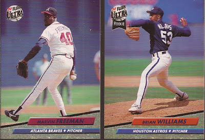
This is the 2nd year of the Ultra brand. Fleer decided after a years of their standard production to jump into a more premium brand. Full bleed. High gloss. Ultra had everything, including 14 cards in a single pack. I broke it into two card scans.
So 90's with the marble background on the name plate. The images were a step up from the regular Fleer releases, and the full bleed (for the most part) was a nice look. Heavy gloss to show off the cards, and a simple logo in the upper corner with the only spot of foil to be found. Sort of like 2015 Topps stole this idea. Good use of the colors to match the teams, except the Yankees are not black but a dark navy blue.
While the images are a step up, they are still kind of sedate and a lot of the same. Ultra improved the images in later years.
Boom - White Sox. And properly black.
Note that the Ultra logo does move about the top of the card. Also, the Rookie flag on the Williams.
Another rook with Ashby. Little too much of the same delivery pose for the pitchers.
Nice image on the Perez, getting the ball just being released. Expo sighting!
Last two card, and both players are admiring their blasts. And by blasts, I mean a pop up to shallow left center. Turning over a card...
Two images - no reuse either. Just the past year in stats and a career total. But holy 90's! Card design brings this to my mind...


1 comment:
Typical list of non-stars that I always seemed to get with those packs.
Post a Comment