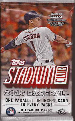
Alright, I need to work on this stash of old packs that I found a few months ago. Plus I have some current packs that need to be posted so I can work them into the sets I am completing. That being said, I am shocked this year's SC release has yet to be posted. What the hell, guys?
Hobby pack, so you get the 2 (3?) bonus cards over the retail release. I think it's three. I've forgotten because I stopped buying this, and I'll explain later. Anyway, since this is from a hobby box, there is a little better than 12% chance I will pull an autograph (2 per 16 pack box).
Not much more to say about the 2016 release that you haven't read on other blogs. Bit of a rip off of 1997 Fleer, just glossier. Thicker stock that usual. Better photo selection. Though, I will touch on that last one. Yes - this is a nice PATP of Norris applying a tag to the Brewers Reed. Good image.
Decent Tatooine shot of O'Brien in those horrible D-Back uniforms. At least it's not the full grays.
And now.....well. You can see this in flagship. They have done shots like this lately. BTW - still getting what I feel are dreadful offers for my 1/1 superfractor of Pujols. Finally listed it for what I think is a fair price. I mean - the guy is a first ballot HOFer. Maybe I'll crack the case, have him autograph it and then pay to have it encased again. But I am digressing...
One card with this type of image has been in Topps flagship each year since 2012. And that is where my issue is coming with this release of SC. I think too many of the image choices are bland. Just not up to SC quality of great shots.
Case in point - Garrett Richards. I don't have an exact number, but in the hobby packs, racks and blaster I have bought, I pulled a lot of cards of pitchers on the mound pitching. About the only set I can't get that from is A&G. Otherwise, I can find this image in S1, S12, Update, GQ, Chrome, Bowman, Bowman Chrome, Archives, Heritage, etc..... Which is why I will probably complete SC, but via dime boxes. No box purchase this year unless the price drop is huge during Black Friday.
Hey - many of the images are great. I just think there are too many bland shots this year.
Luminous dia cut of Andrew Miller. I did my best to white background it to show off the cuts. Not sure if the "M" at the top is there for a reason. I think it's a shout out to Mugatu.
Now I do admit to not following the AL East very well, but who is Paredes? Because with no RC designation, I should have heard this name before. Sorry CommishBob.
Nice newer image of the Babe. I'd love to see Topps put the Babe in a set as a BoSox or a Boston Brave one year. In fact - that would be a great insert for some set: players in unfamiliar uniforms. ©2x3 Heroes, INC.
Here's the back of this year's offering. Colorized photo of the Great Bambino. Retired players get a bio and a career line. Current players get their 2015 stats and then the career line.


2 comments:
The Ruth is great!
I knew this year's Stadium Club design looked familiar but I couldn't recall why. Thanks for pointing out the similarities to 97 Fleer. TSC always has great photography though. And that 'Mugatu' background is fierce!
The Collector
Post a Comment