As anyone who has seen the baseball cards from this year knows, Fleer got a little wild in 1995. There's a lot to digest here, starting with the wrapper. Insert cards became the main selling point at this point, and Fleer made all of the information prominent on the cover of each pack wrapper.
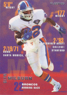
112 - Glyn Milburn - Again, if you know '95 Fleer baseball, you're probably already expecting this. If not, well, buckle up! This is one of several base designs within the set. The colors all match the Broncos uniform, so it does have that going for it.
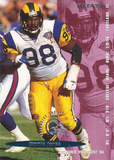
207 - Jimmie Jones - Here's another design, and it's a lot. I've seen this idea used a bunch of times during the mid-'90s on sports cards where they repeat the same photo but put some weird colored shading on it, to make it look extreme or something. Why were the '90s so extreme? Not everything is the X Games, pal.
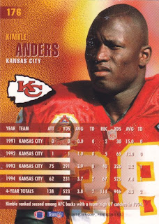
176 - Kimble Anders - Here's a look at the back. All of the backs do look the same.
261 - Derek Brown - Here's another one from that same design, where the background photo is just the foreground photo and a shade of color.
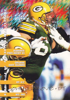
137 - John Jurkovic - This is the third base card design that we've seen so far. The player name in gold foil has sort of a Friends look to it, or maybe Friends meets Frasier?
4 - Drew Bledsoe Pro Visions - Here's our first insert card. Pro Visions were pretty popular as I recall, so I'm a bit surprised there were only 6 of them in this set. I actually kind of like this one, and sports card art isn't usually my thing (and neither are the Patriots, for that matter.)
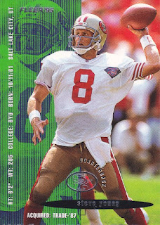
357 - Steve Young - Young is always going to be the second answer to the question: "Name a 49ers Hall of Fame quarterback." Er, I guess that wasn't really a question.
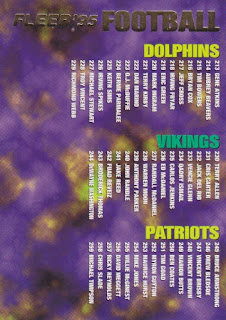
398 - Checklist - It's a checklist. You get it. They couldn't even make these look normal, of course.
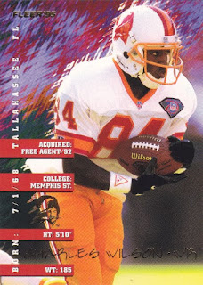
381 - Charles Wilson - It's another classy Friends card. I'm noticing the NFL 75th Anniversary patch that all of the players are wearing from the 1995 season. This must mean that Fleer's set was produced late in the year, or possibly even early in 1996.
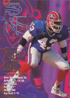
32 - Matt Darby - Here's a fourth distinct base card design. I'm not sure if there was a fifth. I think they were trying to make the player name as difficult to read as possible.
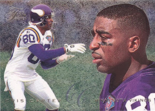
19 - Cris Carter '95 Flair Preview - Lastly, we have something completely different. Each pack contains a Flair preview card that looks like, well, a 1995 Flair card. If you read all of the info on the pack wrapper, you wouldn't have been surprised about this like I was.




4 comments:
Not so keen on the card design, but I love the wrapper, the Bledsoe and the checklist.
Pro Visions or Diamond Kings? I wonder who would win in a battle?
I dig the Denver and Tampa classic uniforms.
I can't say that the set is a favorite of mine, but I'm still glad that it exists, if only because it serves as a reminder of how bonkers things got during the 90's.
Post a Comment