Monday, March 31, 2014

2014 Topps series 1 hobby

Even though we have had 3 games played that count, today is truly Opening Day. It's been a long, cold, windy, snowy, crappy winter for most of us. But here we all are, with visions of the fall classic on the minds of 30 teams. Let's put the official pack of Topps' 2014 release here at APTBNL.


This is the hobby release. Though, the pack is the same for both hobby and retail. Trout is the cover boy, and the guy should have been an award winning super star the past few year's, except for two things: Miguel Cabrera has been better, and the Angels plain stink. If the Angels could make the playoffs, Trout is going to need to spend money on a bigger house for all the awards he'll deservedly win.


So for 2014, Bowman Topps created a design with a wave feeling on the bottom, and put the team name off the right. Player name, the wave bar and the Topps logo are foil. At least with the white background, the name is easy to read. But the off centered design is bad. And the off centered, close up photos don't help matters.


Here is a rare shot that shows more of the player's body. And good work on the centering and framing of the card. However, this is the exception to the set. Most cards don't "feel" this good.


Case in point. Troy is poorly centered in the box. The Rockies name on the right is making this card too heavy towards that side. It's as if Topps is trying to get the Heritage look of the close up head shot photo, but use an action shot to obtain it.


Horizontal cards work. While still a bit too close, the framing on these is far better. Balanced and cropped well.


Many inserts, as usual. I enjoy a nice buyback, though. I don't mind the stamp on the card.


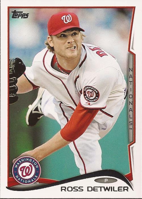
Here's a prime example of the tight framing. Note that Weeks' hand just makes it into the frame. While the centering is very good, this image is far too close. Is the background that bad that we can't get more of it around the players?


Like the orange. Like the helmet logo. Don't like the uniform font.


You get a few goofy images in Topps lately. It's fun. I am not sure how the players feel about this being how they are remembered in 2014. Gatorade gets a nice plug.


Derp.


Nice return for the Future Stars wordmark. Who was the guy in the conference room that suggested it be stamped in foil? He should be slapped. As for the card back.


Nothing major. Vitals, bio, stats and a little "fact". Topps abandoned the numbering to match the uniform deal they used in 2013. Boring, but clean. Clean is a very good thing.

2014 Topps WWE

 Wrestlemania 30 is a week away and WWE 2014 cards came out few weeks ago. Back of the cards of commentary of Jim Ross. Will I get John Cena and Cena-Nation or Daniel Bryan and the Yes Movement or Wyatt Family?

 67 - Ezekiel Jackson - is he even on the roster?
 
80 - Lilian Garcia - ring announcer who been with WWE on and off

3 - Big E. Langston - the current Intercontinental champion who has big future potential to be a main eventer.

SCSA 3 (of 10) - Wins 1998 Royal Rumble -  insert card of championship spotlight featuring toughest S.O.B. Stone Cold Steve Austin who led the big boom in late 90s. This one featured him winning 1998 Royal Rumble that gave him a shot for world heavyweight title at Wrestlemania 14.

 53 - Zeb Colter - manager of Jack Swagger and Antonio Cesaro. Was wrestler known as Dutch Mantel in the 80s and 90s. Once had stint in WWE in 1995 as manager. Worked backstage for TNA before joining his current run at WWE.

95 - William Regal - semi-retired wrestler doing commentary for NXT. Wrestled in WCW in mid 90s then WWE in 2000. Could have been main eventer if demons didn't get best of him around 97-99.

86 - Sheamus - two-time World Heavyweight champion and 2012 Royal Rumble winner. Came back few months ago from injury.

Who's ready for Wrestlemania 30?

Sunday, March 30, 2014

2012-13 Panini Rookie Anthology

I was about to post this, when I noticed I had posted in almost a year ago. I double checked to see if this was just a pack I had in my scan folder and failed to move to the posted, but the cards didn't match. It was then I realized I mistagged the cards last year. Those were the 2011/12 release of Rookie Anthology. I updated the name, and now I should stop blabbing about being an idiot and just get the cards posted.


Five card pack from Panini. No player as the face of this release. Pay close attention to the pack - it mimics the card design. BTW - notice the "no purchase necessary" on the front. I'll be honest, I long tossed the pack. I forget what you could win. I think it was a trip to the 3 HOFs that Panini has a license to create cards - hockey, football and basketball if I remember.


Like I said - look at the pack. It's the design (for the most part) of the cards. Panini sure loves foil, but usually in the wrong place. They used it well on their Score release, as in they hardly used it, and not for the player's name. On many of their other sets, though... Simple design. Really bright, though, with the plain snow background.


Thank GOD the Buffaslug was taken out back like Old Yeller. Take away the white piping and this is how the Sabres should look.


All foil-y. All bad. This is not how you make a hockey card, serialed or not. Granted, you can see the player's name, but it's dreadful.


I got nothing. The Blue Jackets are desperately seeking an image. This isn't it.....


...but this is. The Oilers went back to what worked, because it works. It's a great uniform. They have the look, they have the players - why does the team suck so bad?


All players get a HUGE team logo with their name and bio information, last year's stats and a total. Complete copy in design of the front. At least we don't have photo filter applied image recycle.

Saturday, March 29, 2014

2006-07 Fleer Flair Showcase hockey

Alright, let's throw another pack of hockey I have scanned. I purchased a repack of hockey a few months back from Target and here is one pack we have yet to show - 2006-07 Fleer Flair Showcase. We have seen Flair in baseball, but let's check out a hockey release.


This is the retail release. Cam Ward get the cover on the pack. The 'Canes should not have gotten rid of their unique stripe at the base of their sweaters. Five card pack, and we could pull an autograph.


Think Bowman Platinum. That is the background foil on the face of the card. Two different images. Well....it was an earlier time. Buffaslug on Vanek's jersey. The design is simple, but that bottom is pretty bad. The stark white with the foil is a bad choice.


Change the bottom and this would be decent releases. Could be too much foil background, but at least the player shines in the card. Pun not intended.


The nice thing about this release is the second to last viewing of the square bottom sweaters in the NHL. In 2007, they moved to the Reebok Edge uniforms that have the rounded bottoms. And with those uniforms came the Bettman Stripes. So it's nice to see a decent Colorado uniform instead of the crap that debuted in 2007.


As seems to be the norm in hockey cards, a player changing teams only gets the team change and not a photoshop job. Topps should stick with this.


No hit in the pack. Again - great bottom stripe on the Hurricane's jersey. Unique. Now, they are just average. Flipping the card over.


No image. Again, if you have over 5 years of service, you get the five most recent years listed, and then a grand total. Nice bio blurb on the back, along with the vital personal stats of age, weight, DOB, etc.

A good release. It has it's faults, but it has it's pluses too.

Friday, March 28, 2014

2013-14 Upper Deck series 1 hockey

Another day, more hockey. Let's clear out the folder and post another pack of hockey. This time we are going to look at the current year's design of Upper Deck hockey.


Oh boy, oh boy, oh boy - double rookie class. I think that joke is getting old so that is the last time I'll make it. Shocking to not see Ovechkin, Crosby or Malkin on the cover. In fact, Corey Price is an odd choice. Talented for sure, but certainly not a household name, unless you are from Montreal.


Upper deck loves the bleed, and that is a very, very good thing. Lack of foil on the name is a wonderful thing. The only foil is the UD logo and the foil in the name badge at the bottom. Simple design, though the badge is a kinda bland. As opposed to yesterday's Black Diamond, you can easily see the player's name.


Note how the badge matches the team colors, even if the uniform looks like crap.


Nothing like a great check along the boards.


Oh.

yeah.


I believe these fell about one per pack. Not too bad a card with Brunner.


I will say this about the design (or may just this pack) - not enough great shots like you see in past releases. Too zoomed in.


Here's a zoomed in that works.


I wonder what the guy over Seidenberg's shoulder is considering.

Sorry, I didn't scan the card backs. I think you get the idea what they probably look like. Good design, in my opinion. Photos lack a bit in the usual UD style, but a decent release.

Thursday, March 27, 2014

2013-14 Upper Deck Black Diamond hockey

Wow - I think we all forget about APTBNL. That's not right by any means.

Ok - folder cleaning time. Let's queue up a bunch of packs, starting with UD 13/14 offering of Black Diamond.


Not too much changes when it comes to Black Diamond. It's like the Bowman of hockey - very little changes from year to year. You have the usual levels of cards, from single through quad diamond cards. Hits exist, let's see what we have.


As I said, UD doesn't vary too much from it's past offerings. The one issue each year is the inability to see the player's names without holding the card just right. I do like the background texture to place the focus on the player, though.


In past releases, Black Diamond would use directional hashing in the background. This year, just a flat texture.


I miss these King's alternates.


Here is my big hit from the pack. A nice rookie quad of.....let me look it up since I can't see the name! Mikael Granlund.


And this completes the pack. And the card backs?


Same image with a Instagram sepia filter. While Depres has two years, the standard for players with longer career is on the back - 5 seasons with a total. All in all, the same we have seen before. Zzzzzz...