Monday, April 20, 2015

2014-15 Panini Threads

 NBA playoffs started over the weekend and I got this. This is retail pack of Panini Thread consisting of 10 cards for $4. Let's open....
103 - Kenneth Faried - name runs horizontally near side of the cardboard with team colors on bottom corners and huge Threads logo on the middle bottom. Back consists of last year's stats then totals.
101 - Kelly Olynyk
200 - Zaza Pachulia
199 - Zach Randolf
11 - Marc Gasol (Inside Presence) - insert card which falls in 1:5 packs.
3 - John Stockton (Century Greats) - second insert card of the pack. This one also falls in 1:5 pack. Nice how they put the years he played in the NBA.
47 - Deron Williams
38 - Darren Collison
30 - Chris Mullins - recently named head coach for St. John. Back of his card showed his NBA career stats
23 - Carlos Boozer - what's with Carlos Boozer cards I been getting this year?

Good photography as every card has picture of a ball in it. Who will make it to the finals?

Tuesday, April 14, 2015

2015 Topps Gypsy Queen

I am racing to have this written and posted PRIOR to the official release of the product. Call this an instant request. As usual, my Target fails to understand "release date" and put the cards out early, which is a benefit for me, and not for much of the rest of the world. May they never promote or fire my Target store's manager.


This is obviously the retail release. I bought a blaster and a rack pack. The cards you see are pulled from the rack pack. Wizard of Oz is our GQ poster child this year. Batting helmet with no ear flap.The pack design mimics the card design, but barely. Font for sure, but otherwise, the base cards as a different beagle.


Good first card with a White Sox. Interesting unbalanced design. Granted, pretty much all cards are unbalanced, but this one is radical. I like the style, though. It a nice change from last year's release. Brown border with the beige characters and filigree. Same Instagram filtering on the photo, but it's to be expected in GQ.


Straight to the throwback binder for you, Mr. Singleton. Decent photos and cropping on the cards.


As they have done, there are slight border color variations on come cards. It is not your eyes - this Davis is a lighter shade than the last two cards. It's card #275, so not a short print. I like these color changes. Gives the set a nicer, warm feel.


So far, I haven't seen Topps use that keyhole space as a use for the picture, which is good. It's just the design and that is how it should stay.


Last card of the set. With the design, you can really see, and feel, the issue of the card being out of balance. This thing just wants to fall to the right. But I like it. I'm okay with this bad centering on this set.


Not much has changed on the back, except for a larger font and far less words. I call this a plus.


OMG I LOVE THIS MINI SET!!!! This set screams A&G, and it is just plain awesome. These fall one out of every 24 packs per the wrapper. I will be completing these minis, so feel free to send them my way.

OK - 7:49pm CDT on 4/14/15. "Post a pack prior to the street release date" achievement unlocked!

Thursday, April 09, 2015

2014 Donruss series 2

The 2015 version of this hit the shelf (and the blog) a couple weeks back. Somehow, we never posted the 2014 release. Well fear not, loyal readers - my overstuffed scan folder came to the rescue, with a little help from the random number generator. Let's waste no more time and get posting.


With others, I was excited that the Donruss brand was coming back with baseball cards. Even without the license, I figure it would look pretty nice and be a good homage to the releases of the past. I mean - dig that old school logo on the wrapper!!! That's memories right there. Eight cards in a pack. Abreu on the cover - no surprise there.


I really wanted to like it. I tried, but I just couldn't. The design has a "based off Donruss feel" to it. But something just isn't right. The bar is not centered for starters. The logo seems too big. The lack of logos really shows and hurts the design. My biggest issue, though, is the stock. Way, way, way, way too glossy for Donruss. And when I hold it, and want to sense I am holding a Donruss card from the late 80's. This feels like......I don't know. Something foreign.


They do a decent job with photo selection....considering. I understand you want to cut down on what you need to shop out of the card.


Maybe it's less to erase when it's an alternate uniform, but I really hate when these are on cards. Then again, a solid gray look would probably be pretty hard on the eyes.


Texas' primary color is blue. Why a red border?


I wonder how much photoshopping is done to the background? Alter the ads!


Final base card of the pack. Brutal to look at. Here's the backs before we hit the inserts.


Again, they are an amazing interpretation of the old Donruss cards, with the player's middle name and such. Single line stat and a career total, which is not how the old card was.


Even if this had a logo, I think this is a weak Diamond Kings design. Feels way too much like a Microsoft Office template. Panini, you can do better.


Insert from the Panini Elite brand. I can't even remember if that was a separate release last year. And I really don't care either.

I want to like Doruss. But 2014 isn't that good, and 2015 is equally low in my eyes. But don't take my word. If you like it, collect it. Hell - I think 2004 Topps is an awesome set, so....

Sunday, April 05, 2015

2014-15 Upper Deck NCAA March Madness

It all comes down to Duke vs Wisconsin in winner takes all for NCAA Basketball championship. Upper Deck put out 200 card March Madness set featuring player highlights from tournament history. Hobby pack contain 5 cards. Sephia ton cards call 1:6 along with short prints, autographs, and bracketology sweepstakes cards. Who's holding Duke or Wisconsin card right now? On to the pack....
 AH-1 - Anfernee Hardaway - good selection of photo on this one as the pre-Penny about swat the ball out of shooter's hand. Front of card shows the name, game location and date. Back of card feature college stats and his tournament highlight from that game.
MG-1 - Magic Johnson - remember when Magic had hair? He would go to NBA winning titles and MVPs with showman and pizazz.
BW-2 - Bill Walton - strange on his own card they use photo of him about get posterized from dunkin' David Thompson.
JS-3 - Jerry Stackhouse - sephia tone card which fell 1:6 packs. It also happens to be a short print. Excellent photo use of Stackhouse posterizing this Boston College player
BR-1 - Bill Russell - short print card of Russell featuring him celebrating championship. He would go on winning more championships in the NBA.

I like photography selection on the cards. Got two short prints out of this pack. Good luck to Duke and Wisconsin in the championship. May best team win.

Tuesday, March 31, 2015

2014-2015 Upper Deck Hockey Series 2

It's nice to see that Upper Deck can still put out a quality product.  I wish I was more into hockey because I'd love to be putting together Upper Deck base sets again.  Same layout at Series 1. I love the no border full bleed cards.


This card freaked me out a little.


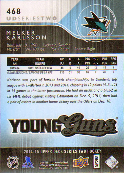
No auto or relic in the pack, but I did snag a great Young Guns. These fall about 1:4 or 6 per hobby box.


Friday, March 27, 2015

2014-15 Fleer Showcase Hockey

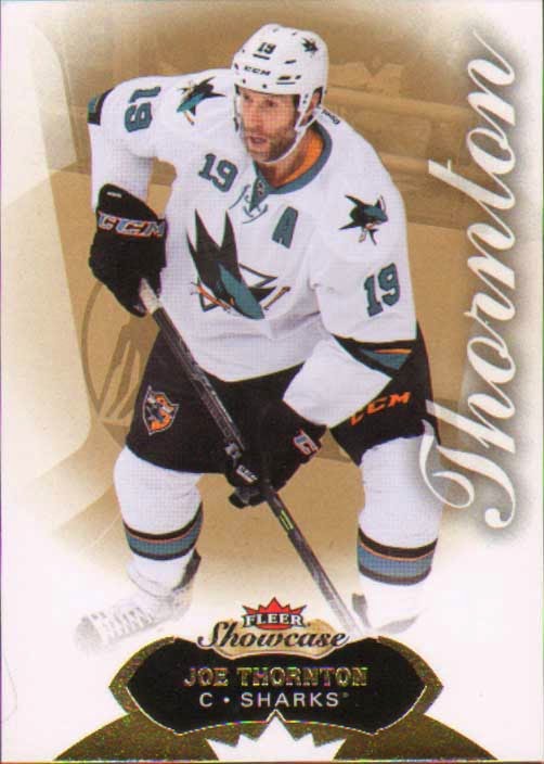
While I'm not a big hockey fan, I couldn't resist picking up a pack of this year's Showcase.  Don's card shop had a couple hits on display and they were pretty sweet.  Sadly I didn't hit anything.  Not pictured is the huge decoy that was alongside the 5 cards.


I did get one insert, this sweet Metal Universe.