Friday, August 07, 2015

2005 Topps Heritage

Whoa - been too long since we had a post, and I have a crapton of stuff to post. If you read my blog, 1) thank you and 2) you get the story of how I came across 2 packs of this product in my basement. I posted a few cards there, but to do this all proper-like, I need to show a full pack on APTBNL.


That......is bright. Man, the 50's were an era of really bright things. All that nuclear stuff going on. As you know, the 2005 Heritage release was a homage to the 1956 design, all horizontal, except for the insert that weren't! 8 cards in a pack, with less if you got a hit. Plus bubble gum! Let's go.


About the only fault I have with the cards in the background image. In the '56 release, they were always action shots. There are posed shots in Heritage, and that sets it back just a bit from the original. Sure, it's a great design - good layout, large portrait, name and team in nice contrasting colors with easy to read fonts. It's just the cards without the action shot are too stale.


YES!!! That's a '56 Topps. And it's so pretty, with the washed out colors and the blurred image. I may have to look back and grab a set of the '05 Heritage. And possibly build the '56 set.


That is not to say ALL action shots are good. What's with the multitude of empty seats? The background images on the 1956 set, from what I can recall, showed the players and the field. Nothing of the stands. I could be wrong in this, though.


Smile, Placido.


Were there manager cards in the original?


Here is one of the insert sets in the product. Insert sets, to me, are far less about the honoring of the original and more about pushing the completest to purchase more cards. Thank goodness for ebay, Sportlots, JustCommons and the others. The colors here aren't bad, but being vertical is just silly. It's a horizontal set for cripe's sake.The vertical inserts are not a good thing with this release.


Meh at best.


Hey!! I pulled a White Sox, and a PC guy to boot. I would love to ask Crede why he decided to go from pajama pants to high cuffs. Card backs...


Full player name and bio information. Just the previous year stats and a total, just like 1956. Plus you get 3 comics. Ahhhh, the good old days. I could nitpit the backs and say the comics are a little too neat compared to the old, but it's more a sign of the times that they are cleaner. Think Disney cartoon 1956 compared to 2005 .

So no hit, but I did pull this-


I get my gum, and for 10 year old gum, it is still fresh. Thinking about chewing it...

Tuesday, July 28, 2015

1994 Topps Stadium Club Baseball Series 1

Pack of 1994 TSC featuring 12 cards. Set divided by 3 series with 240 cards in each one.
Info card. Notice its labeled 4 of 10? Now have 10 of those useless things. This one mention about Superteam redemption cards contest. Since World Series was cancelled no one won. Looks like its where Upper Deck came up with "Crash the Game" redemption cards for following year.
260 - Ron Gant - slick photography with name on front in different design. First name in lower case roman times font in appears to from "torn" typewriter paper. Last name in CAPITAL LETTERS from old school style label printer.
129 - Arthur Rhodes - had unpleasant autograph signing back in 2005
251 - Danny Darwin - back of card featuring pre-sabrematrics stats. Pitchers has how did they get the batter out by percentage. Topps included their own skill ratings as well tossing in descriptive words on their play.
151 - Tony Gwynn - good shot of the late Tony Gwynn. Topps nailed it with genius when it comes to batting. His percentage stats feature what kind of hits he made of the season.
131 - Tim Naehring - Kenny Lofton is safe
239 - Cris Carpenter
197 - Mark Gubicza
231 - Bernard Gilkey - ump called him out
220 - Doc Gooden - pitching on front of card; batting stance on back of his card
86 - John O'Donoghue - TSC mentioned when he made his MLB debut
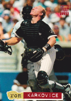
57 - Ron Karkovice
184 - John Doherty

Still good use of photography on cards but the names design can be eyesore.

Sunday, July 19, 2015

2015 Upper Deck Goodwin Champions

In 2009 Upper Deck put out it's answer to Topps' popular Allen and Ginter, Goodwin Champions.  The 2009 set was pretty good, but since then Upper Deck has lost all it's major licenses except hockey, so the set has really become kind of a joke.  This year continues that trend.  There are some decent autograph subjects, but for the most part it's become what's the most ridiculous way we can portray our subjects

We get a whole 5 cards per pack so hold on to your hats.

First up old timey Hall of Famer John McGraw portrayed as a gangster.

Next up is Tony Hawk.  And believe it or not doing what Tony Hawk does.  Not a bad card at all, but then I don't think there's a skateboarding license so....

Another Hall of Famer in a different sport with the type of ball he use to play his sport with.  Wow.

 I also got a short print with another Hall of Famer doing nothing he is in his Hall of Famer for. Bill Russell looks more like a philosopher than a basketball player.

I also pulled a Goudey insert. These cards fall about 1 in 5.  Ivan Stewart was a race car driver.  He too belongs to a couple Hall of Fames and is not doing anything close to what he did to get into them.

There you go.  5 cards.  This probably would be a fun box to break if it was closer in price to Score than Allen and Ginter.

Tuesday, July 14, 2015

1994 O-Pee-Chee baseball

Ramdomizer went for the wayback machine today, selecting a pack of 1994 OPC baseball. Now, by this time, OPC had stopped using the Topps template and developed it's own design. Here is the 4th year they did things on their own.


As was the case back in the 90's, you got a crapload of cards in a pack. 14 this time around. So much green. Pay attention to some of the special notations on the pack:

*Borderless
* 1 special insert
* Blue Jays
* Diamond Dynamos
* Redemption cards

No idea, besides the whole Canadian angle, they would single out Blue Jays. It's not like '94 was their first year. And I am not sure what you could have gotten via redemption. Maybe I scanned something about that. Let's go.


Boom! White Sox right out of the pack. Full bleed design, just as they billed. Got the French position on the front like the English. Newer O-Pee-Chee logo (so trendy). Design it not too bad. Not really liking the team name in that bar on the left, but the rest doesn't detract from the image, which is the whole reason for the card.


No shock the team name color changes to match the team colors. I guess the northern neighbors can't take all that space between the last name and the position designation. The padding of that area is not too distracting, but I would have gone with a more muted color.


Maybe just a little too close on the images. That is about my only gripe. Going to just blow through the rest of the pack. My chatter is annoying, I bet.


Giants team name is unreadable on this card.


Bubble gum alert!


While the team name works much better on the horizontal cards, the bar at the bottom does not.


Man, Dave - Twinkie uniforms are not your style.


Listed first as an outfielder, but then a first baseman. Used a 1B image.


And nope, that is not a mistake. The collation in this pack sucked.


TWICE!


And card #14 was a checklist. My special insert?


My guess is this qualifies as the "Special Inset", except.....


The stupid thing is an ad to sell you a special gold edition. This is only special in that you make more money off me, OPC! Let's see some backs....


Full stats on the back. Always nice. That OPC logo in front of the card number. Not so nice. Here's the interesting thing:


Dave get the horizontal back because of his years in the big league. The standard back is this. Which is SUPER FRUSTRATING because the card numbers do not line up. Shame on you, OPC.