Wednesday, March 19, 2014

2013 Topps Gypsy Queen Parallel Pack

Greetings...

Hope everyone is doing well.  Did you get your brackets filled out?  How about that one contest where the winner gets $1 Billion dollars?

Anyway, here's a quick post for tonight.  It's a 2013 Topps Gypsy Queen Parallel Pack!

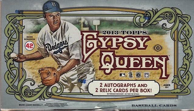
Box image from the interwebs because I didn't scan the Value Pack.


Anyway, Value Packs for this release contained three packs of Gypsy Queen, as well as an unmarked pack of white bordered parallel cards.  Here's what I got:


#292 - Ian Desmond
#74 - Josh Rutledge
#42 - Jose Quintana

These are thicker than the normal card with the white border framing the image.  Not too bad.  The backs are still bad and very yellow though:


Anyway, that's it for now.  More later.  Enjoy the tournament and thanks for reading!

Saturday, March 15, 2014

2014 Topps Heritage

Last year, I guess being the (at the moment) 2 time blogger of the year (now 3 time), a certain barn dwelling avian had permission to get his thong in a bind over the lateness of the ripping and posting of a pack of Heritage. Let's keep him happy this year, shall we?


The pack is a nice copy of the original release. Back then, though, the embossed cards fell one per pack instead of being an insert. Plus, the hobby logo replaced the nickel selling point. Well, life does change, ya know. Let's rip.


Besides the registered and trade make designations, Topps did a fine job with the front of the card. Legal is what legal is nowadays. The font is pretty close, except the "U" is too wide.


Mostly head shots, which is about what the '65 set was, except for one thing that I finally put my finger on.


When you look behind the players...


There is little or no stadium. That was the joy of the 1965 set (and many the years before). The photos were taken within the parks of the club. Card releases were after the season started, so they would get the pictures during the early games and release the cards later. Now, with the rush to get the set out around spring training, you get a lot of blah pictures. No soul without the stadium backdrop. Maybe it's just me.


Boom. Action short print. Yeah for me!


See, you would get the background not looking like some tie dyed shirt, but an actual ball park.


All in all, Heritage is still a nice change of pace from the flagship release.


Reverse? NAILED!!!! Great job again with the back. Very faithful to the original, and the cartoons coming back is a welcome site.


Plenty of inserts again this year. See - THAT is an image of a ballplayer. It's probably the closeness of the photographer to the object.


Good job on the rookie cards too. I am guessing rookies will have a photoshopped cap instead of a blank that appeared on some cards.

When all is said and done, Topps did a decent job with Heritage yet again. Now don't you have a deadline to meet, Owl?

Tuesday, March 11, 2014

2013-14 Panini Totally Certified hockey

We all know this will be the last year (for a while) of any hockey cards that do not have the Upper Deck logo. Panini has done a pretty decent job with their releases, so there will be a void in the sport for the brand. They are making the most of their time they have left. I picked up their slightly higher end release of Totally Certified. While I like other releases, I would not be too sad seeing this one disappear.


Do packs getting any more boring? Holy crap - DOUBLE ROOKIE CLASS?!?!?! I am just learning about this now? (/snark) Five cards in a pack with a guaranteed hit within.


You can see why I would not mourn the loss of this set. REALLY bland. The set logo is way too large and pretty much the easiest thing to read. Who is this? Who knows? Yeah - his name is down there below the logo, but the design and the foil completely loses it. I can tell you, in hand, it is just as hard to read. FYI - this is Tyler Myers.


Here is a serialed hit numbered to 50. I can't complain about the pull of a Stastny, except it is not a Blackhawk.


Shea Weber. That radiant pattern you see goes all around the player. You really cannot see it that well from my scanner, but it's there.


Quick - is this the actual back for this set or the back for any other Panini release? Here is the one part of most of Panini's releases I hate.


Rookie class of Varlamov. This is a nice pull with the season he is having. The weird thing about the rookie class cards is that the team name is just above the player's name, instead of at the top. Weird.


And my hit. Fourth line winger for the Caps. Not a good hit at all. Oh well, that happens.

Average pack with not a lot of greatness within. If you see something you want/need, you can find my email at my blog.

Saturday, March 08, 2014

1995 Fleer Baseball

Spring training started and regular season coming up in few weeks. Let's open packs. What can be said about 1995 Fleer baseball. They went experimental on design and result is a psychedelic mess. Every single card is somewhat different.

483 - Al Martin - back has full stats and player's last name. Front, well, let's see. Player in action. There's a logo in small print then large watermark. There's uniform number the player used. The name along with position and info in small print. Then glob of colorful mess.

54 - Chris Gomez - got the player then no logo, 4/5 of the name watermark follow with name, team, jersey number, position, and info in small print. Then there's the green on the right.

41 - John Valentin - like the design above with what looks to be some form of blue

425 - Steve Traschel - like Al Martin card design except info on the left and logo and large watermark on the right. The pitcher gave up, at the time, record breaking 62nd homerun to Mark McGwire.

305 - David Justice - this design has large team logo and the player with small info print. Background has player in hue form. A star player with 3 All-Star appearances.

538 - Delino DeShields - this design they tried fit everything around with name, number, and small print info. On the background has small pictures of DeShields trying get Andy Warhol look.

   
AS15 - Mickey Tettleton/Fred McGriff - insert card of starting All-Star players from 1994 game. AL player on the front and NL player on the back. I like how they stamp logos on each side.

  
355 - Mike Lansing - see David Justice card on design. Lansing waiting for ground ball while in the background he's swinging the bat in a solarized hue color.

587 - Mark Portugal - see Delino DeShields design in good try but awful looking Andy Warhol background.

  
184 - Jose Mercedes - just wow. This is a mess. Got the player name while his info in much larger print and the last name in much bigger print. For Mercdes he would lead the AL in losses in 2001.

 
518 - Andres Gallaraga - Now they somehow got this card right. Gallaraga making contact with the ball and got Warhol-ized on the background.

156 - Gary Gaetti - see Jose Mercedes card on this mess.

In 95 Fleer went crazy on card design trying feature cards like artwork. This design was carried over to their basketball and hockey sets of that year. Experimental but failed big time. Artwork design didn't work out on baseball AND basketball yet strangely the design looked good on hockey cards. I didn't like this set yet I liked 95 Fleer hockey which has the same design.

Anyway season starts in few more weeks.

Friday, March 07, 2014

2012 Panini NFL Stickers


Just a little bit of a plug for my blog before I get started here: I just busted up a 2010 Topps NFL factory set, and I don't really collect football cards. If you're interested in a player, team, school or some combination of those things, let me know. I could send you cards and you could send some back. It could be fun? And now, here's something I bought for 50 cents.


18 - Mario Williams - Let me just say that I really don't like how the player name is not aligned properly.


81 - Jermaine Gresham - I remember him from his Oklahoma days.


242 - Dez Bryant - Oklahoma State here. Kind of a troublemaker. Can you tell that I pay more attention to college football than the pros?


450 - Brandon Browner - Oregon State Beavers alum. Got busted for Adderall or something and just got recently reinstated.


492 - Cortez Kennedy - It's nice to see some old school players in this set. Also, this is sticker #492? That's a lot of stickers to collect!


 285 - Chicago Bears - Team stickers are sticker album staples.
 

267 - Jeremy Maclin - Here's one for my own collection. I am a quiet Eagles fan.

Wednesday, March 05, 2014

1994-95 Fleer Series 1 Basketball


First of all, wow! Just look at this wrapper! Aren't you excited already? Just how many cosmic basketball games are going on at once on this thing? Here's one of those many shining examples of the '90s looking and acting exactly like the '90s, with 21 cards crammed into an affordably priced pack of cards.


143 - Kevin Edwards - He looks apologetic for simply being Kevin Edwards.


37 - Scott Williams - The backs are aligned like early Upper Deck, with a new full color photo on the left side.


188 - Clifford Robinson - Here's a Blazers card for me. The foil is not my favorite thing that Fleer has done.


64 - Greg Anderson


120 - Rony Seikaly - Seikaly is a throwback to an era when it wasn't ridiculously easy to completely loathe the Heat.


33 - Luc Longley - Longley was an Australia native and very tall. 7'2"!


234 - Don MacLean - Not the American Pie guy.


101 - Mark Jackson - Jackson is currently the Warriors head coach.


66 - Sean Elliott - There was one season where things got really weird and Sean Elliott wasn't a member of the Spurs for some reason. Look how sad he looks!


7 - Andrew Lang


11 - Lindsey Hunter Rookie Sensation - There was once a time when Rookie Sensations were a big deal. This card just look like it's throwing up at you and screaming at you at the same time. Also, Hunter looks like he's pushing 35 already.


59 - Robert Pack - This card has terrible corners and a huge crease in it. In the middle of a pack! What gives?


145 - Chris Morris


235 - Gheorghe Muresan - Muresan thinks Luc Longley is a shrimp. (Longley thinks Muresan is a lousy actor.)


152 - Anthony Mason


172 - Clarence Weatherspoon - Man, those Sixers jerseys...


138 - Michael Williams


53 - Jamal Mashburn - Mash could light it up.


160 - Shaquille O'Neal - This is a pretty great shot of Shaq.


42 - Larry Nance


94 - Byron Scott - Scott was fired by the Cavs a year ago and still doesn't have a job.