This is the hobby release. Though, the pack is the same for both hobby and retail. Trout is the cover boy, and the guy should have been an award winning super star the past few year's, except for two things: Miguel Cabrera has been better, and the Angels plain stink. If the Angels could make the playoffs, Trout is going to need to spend money on a bigger house for all the awards he'll deservedly win.
So for 2014,
Here is a rare shot that shows more of the player's body. And good work on the centering and framing of the card. However, this is the exception to the set. Most cards don't "feel" this good.
Case in point. Troy is poorly centered in the box. The Rockies name on the right is making this card too heavy towards that side. It's as if Topps is trying to get the Heritage look of the close up head shot photo, but use an action shot to obtain it.
Horizontal cards work. While still a bit too close, the framing on these is far better. Balanced and cropped well.
Many inserts, as usual. I enjoy a nice buyback, though. I don't mind the stamp on the card.
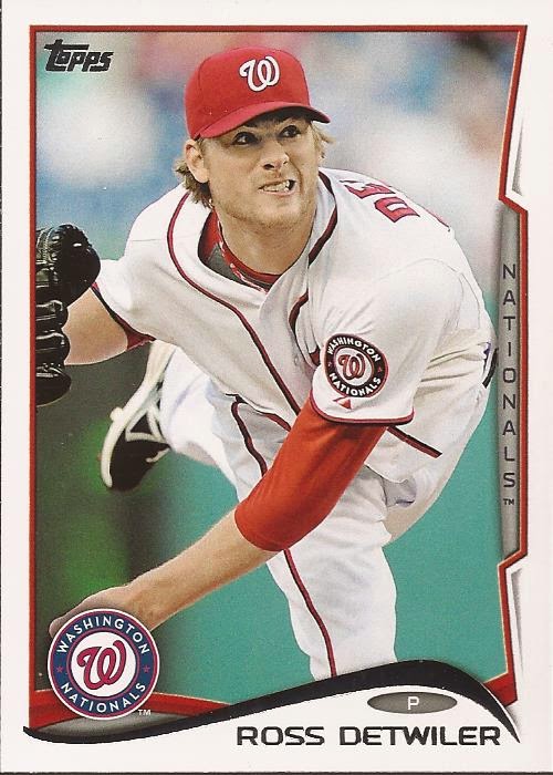
Here's a prime example of the tight framing. Note that Weeks' hand just makes it into the frame. While the centering is very good, this image is far too close. Is the background that bad that we can't get more of it around the players?
Like the orange. Like the helmet logo. Don't like the uniform font.
You get a few goofy images in Topps lately. It's fun. I am not sure how the players feel about this being how they are remembered in 2014. Gatorade gets a nice plug.
Derp.
Nice return for the Future Stars wordmark. Who was the guy in the conference room that suggested it be stamped in foil? He should be slapped. As for the card back.
Nothing major. Vitals, bio, stats and a little "fact". Topps abandoned the numbering to match the uniform deal they used in 2013. Boring, but clean. Clean is a very good thing.


2 comments:
I like the Moreland pic. It's nice they captured the ball too.
Holy crap, I want a card of a guy named Whammy! I have a modest size stack of 2014 Topps cards but for some reason I have seriously pulled 6 of the Tulo card.
Post a Comment