So here goes. This is a 12 card retail pack.
Here is the front.

Here is the back.

First card in the pack:
317 Ryan Doumit

254 Edwin Jackson

222 Curtis Granderson

This is what the backs look like.

92 David Eckstein

227 Josh Thole

328 Chicago Cubs

The back lists HR, RBI, AVG, Wins, Strikeouts and ERA leaders for the Cubs. I'm too lazy to scan the back, but it's a photo of Lou Pinella.
CMT-24 (Cards Your Mom Threw Out)

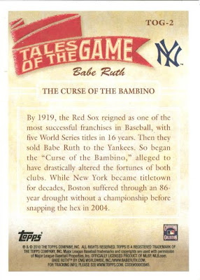
Here's the back.

TOG-2

This card details The Curse of the Bambino.

TTT9 Roy Halladay

I'm kind of tired of the old Toppstown cards. These are a welcome change.
240 Ricky Romero
185 Hideki Matsui
74 Casey Blake

I don't like the big swoosh thing on the side. I do like the big Team logo and the player name with a silver background is kind of nice. Maybe it's just me, but I don't like the photos in the cards so far. The only one that I even sort of like is the Mets card and I think that it's because it's a cool action shot.

10 comments:
Alright...I like the play at the plate. Still haven't seen any of these.
I can't stand the enormous logos. I'd be interested to find out what percentage of the cards have part of the player obscured by the team logos.
I actually have seen quite a few photos that were a step up from last years product in my mind, but I totally agree when it comes to that damn color swoosh on the side. It like fades into the photo and in a lot of cases the color of the swoosh just matches the dominant color of the photo too well. Examples would be the Josh Thole and the Cubs cards.
I am mixed on the swoosh - it is nice to have an accent on the card, but I hate to take up space on the photo.
I do like the photography so far, maybe I will change my opinion when I see the actual cards, or when I see UDs offering. After the disaster of 2008 all cards look good to me.
I like the design, but I never have cared for cards featuring players' backsides. It seems like this set has a lot of them.
I thought UD 08 was pretty nice. Good photos, printing quality, and cardstock as they usually have. The design wasn't half bad in my mind. Now, 07 UD that was a lousy design.
Am I the only person who likes 07 UD? I should start a support group.
Cards Your Mom Threw Out is a very odd name for an insert set. Also, the back of that Yount card strikes me as praising themselves a bit too much.
I agree about the swoosh. If it were a little more subtle, or even absent, the logos would look less dominant.
I am just thrilled, though, about two different photos appearing on the front and the back of each card in a base product.
I can't stand how lazy some set development has been in recent years with either repeated / cropped versions of the same photo on the same card.
Post a Comment