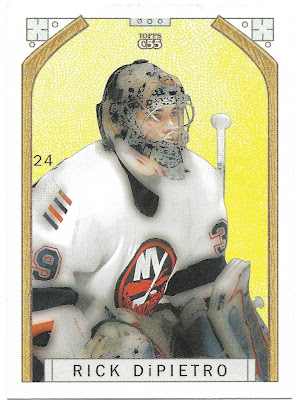
The 2003-04 Topps C55 is basically a copy of the 1911 C55 hockey cards that were included with packs of Imperial Tobacco. Topps copied the design and layout of the 1911 C55s. They even filtered the pictures so they would match the quality of hockey card photography from 1911. While the novelty is nice, it is an easily forgettable set.
I believe there is one mini card per pack. You do have a chance at a "repurchased card", which must be the Original C55 cards advertised on the front. With one in every 6,390 packs, the odds are against you.
Felix Potvin played a single season with the Boston Bruins, his last in the NHL.
Here are the backs of the cards. Topps copied the design of the 1911 C55s here as well. Hockey cards backs have come a long way.
Originally a Montreal Canadien, Tomas was had his breakout season with the Predators in 2002-03.
A good pack for goalies. Although this one hurts as an Islanders fan.
I remember having this guy in my Fantasy leagues. Always seemed to be on the cusp of becoming a star but never fulfilled. Played a decade in Europe after the leaving the NHL.
A mini card! Oh joy. 1.5 x 2.5. I was never a fan of mini cards. Even worse with this set, there are several parallels backs to chase.
Stanley Cup Winners is an insert set. I am surprised they didn't use a filter on the team logo to age it. One nice thing about these inserts is that the backs actually have some information. The historical info goes well with the feel of the set.
Long-time Oiler Ryan Smyth. That's with two Ys. You may notice the inconsistent smudging of the yellowish background. I assume this was another attempt to mimic the 1911 set.
You may have noticed the small numbers on the front of the card. Sergei Gonchar is card #45 in the set, as shown just over his shoulder.


2 comments:
Nice looking cards. Interesting to have the card number on the front and back of each card.
Wow. You are right -- totally forgettable.
I appreciate the concept they were going for, but....ugh. The execution.
The funny thing is that they couldn't really seem to see the forest for the trees here. It's a boring design (doesn't matter if it's pre-war), and the image treatment just clashes with the modern equipment, jersey material, and team logos.
I mean, plastic didn't even *exist* when the original C55 set was released.
Post a Comment