
Let's keep the folder cleaning going - day 2, more football. Yet another pack wars pack.

We will get licensed NFL teams and players this time around. Like the baseball Archives, Topps dives into their older designs. With 2013, Topps goes back to showcase 4 different styles: 1959, 1976, 1985 and 1986.

Let's start with 1959. Decent design, but a crappy image when you throw the pink glove on the card. Plus the 1959 cards were posed shots, not action.

Somewhat faithful back. I like the retro font for the quiz question. But the long bio does not belong. It should be a blank area to rub a coin and reveal the answer. Score - 6/10

Moving to 1976. Again with the action shot. I guess that's what the kids what nowadays. Or you just can't get the players to pose like you used to.

The back is closer to the original than the '59. Granted, you have the logos in the lower right, but all that legal crap is just required with the cards produced now. Score: 7/10

Jumping to 1985. Again with the action photo, but dang Topps hit the mark on the front. Even to the word make in the upper left. Font in a little too close, but it's a good look.

Only the card stock sets this design back. Good job on this year, Topps. Score: 9/10

Last we have 1986. The green is all wrong. The font colors are all wrong. The font style is all wrong. It's close, but not close enough.

The back is a bit better. Just the different logos at the lower right. Getting the back right saves the front. Score:7/10 Here's the rest of the pack.


And I got one insert in the pack.

Homage to the 1970 Glossy. Rounded corners. Seeded one in every six packs.

We will get licensed NFL teams and players this time around. Like the baseball Archives, Topps dives into their older designs. With 2013, Topps goes back to showcase 4 different styles: 1959, 1976, 1985 and 1986.

Let's start with 1959. Decent design, but a crappy image when you throw the pink glove on the card. Plus the 1959 cards were posed shots, not action.

Somewhat faithful back. I like the retro font for the quiz question. But the long bio does not belong. It should be a blank area to rub a coin and reveal the answer. Score - 6/10

Moving to 1976. Again with the action shot. I guess that's what the kids what nowadays. Or you just can't get the players to pose like you used to.

The back is closer to the original than the '59. Granted, you have the logos in the lower right, but all that legal crap is just required with the cards produced now. Score: 7/10

Jumping to 1985. Again with the action photo, but dang Topps hit the mark on the front. Even to the word make in the upper left. Font in a little too close, but it's a good look.

Only the card stock sets this design back. Good job on this year, Topps. Score: 9/10

Last we have 1986. The green is all wrong. The font colors are all wrong. The font style is all wrong. It's close, but not close enough.

The back is a bit better. Just the different logos at the lower right. Getting the back right saves the front. Score:7/10 Here's the rest of the pack.


And I got one insert in the pack.
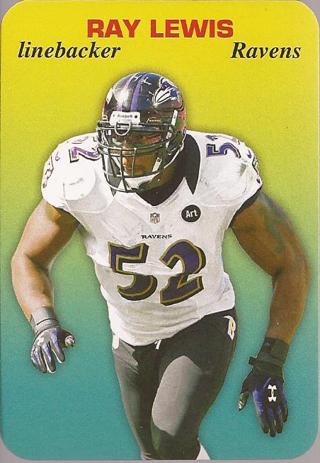
Homage to the 1970 Glossy. Rounded corners. Seeded one in every six packs.
No comments:
Post a Comment