

Hobby version, with 6 cards in a pack. Foil city on the pack, as this is the knockoff version of Chrome. Panini is pushing the on-card autos, though you can get plenty of sticker autos in this set. We know these will be tough on the eyes, but let's just get this over with.

At least they didn't change the color red as Panini likes to do when shopping out the logos. Standard look of Prizm, but there is far more color than last year. They didn't fade out the background, and it's a definite improvement. Not saying these are great cards in the long run, but the added brightness of the card adds a lot of points to the design.
I am going to focus on areas of each card for a reason we'll talk about at the end. Click on the card to get a larger view. For Holliday - look at that weird scan spot below the word "Louis"

So much more pop with the brighter background colors. You almost forget these are logo free and basically crappy. For CC, remember the top right corner, plus that dotted border just above "York". See what looks like a flash highlight?

I think the bland uniforms don't translate well when you take out the logos. The focus on Jimmy is the border all the way around, especially lower left.

I'm actually going to say it - this is not that bad looking of a card. The badging and the border is too large, but more cards in this vein could make Prizm a poor man's Chrome, except it's just as expensive. On Nate, note 3 of the four corners. Not so much lower left.

Lot of red with the fans in the seats. With Votto, notice that blemish on the "AN" in the Panini badge.

No shock with the back, but I like the color photo way better than when they run the picture thru an Instagram filter. Just the career stat line. For the back, pay attention to the bio box with his birthdate.
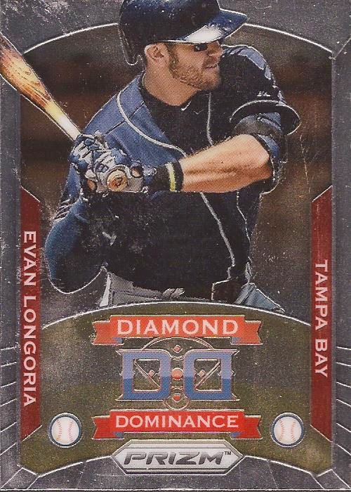
Last card yielded me an insert. Now we are back to the crappy, faded images. The design is high school computer class. For Evan, just take in the whole card look.
Now, why focus on all these cards closer? Panini did something interesting with Prizm - they stuffed the packs with cocaine. As least it felt like coke. Maybe it was some kind of baby powder or flour. But these are all not bad scans - what you see is the residue of the powder they put in the packs to keep the cards from sticking together. I scanned the Longoria last, and didn't clean off the glass between scans, so you can see the build up of powder that came off the cards. It was very weird to rip open a pack and feel the grittiness on them.
1 comment:
It's corn starch. Well, technically they call it "Organic Press Powder", but that's what it is. It's used during the printing process, since everything is extra glossy, to keep them from sticking together.
I actually bought a good amount of Prizm this year and dealt with a ton of it. I kept an old tshirt-rag handy and wiped off each card and it seemed to do the trick. Some of it smudges a little, especially if you touch the card face and then wipe (it sticks to the natural oils in your skin), but if the cloth is soft, it shouldn't hurt anything to give them a good firm wipe down before you put them in a binder page or box.
Buff them, almost like a car, and that chrome really starts to shine. lol.
Post a Comment