

Horizontal pack design alert. My favorite part is not how many cards are in the pack, but that there is "8 CARDS PER PACK!". What is with the exclamation point? Have I not noticed that on other wrappers in the past? Let's dive in.

Well, the front is clean. Not sure I like the drop shadow on the players name. In fact, there are too many different fonts on the front.

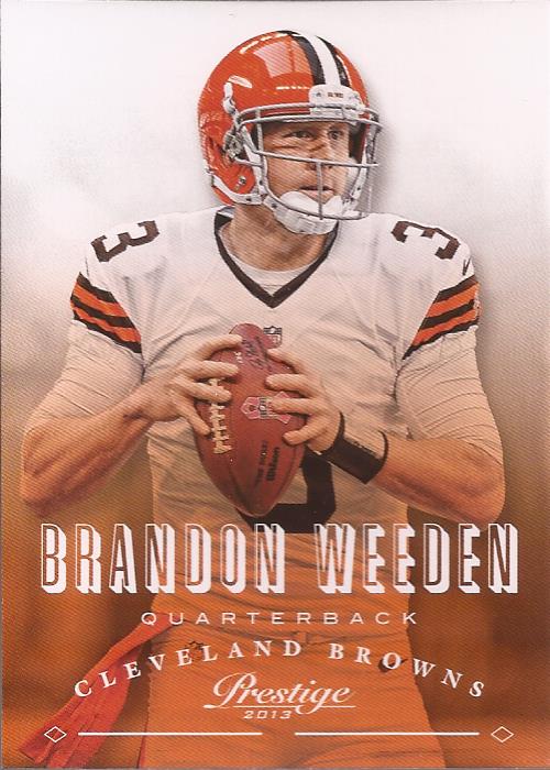
You see the whole color fade is based on one of the teams primary colors.

However, when you wash out the background, and then have a player wearing a lot of white, you really can lose the subject on the card. It's just not working here, Panini.

Now this is an interesting insert. Design is decent - I get the whole "on the highway" motif. It's the photoshopping that is interesting. The TV numbers on the shoulder are WAY TOO BIG. The shoulder stripes are rounded and look horrible. But the most interesting part is this is no standard photoshop. What caught my eye in that seam just above the front numbers that runs across his chest. If you look at images of Lacy in his 'Bama gear, the uniform cut is very different. So either this is a shop job with a head replacement on someone else's body, or Panini went the extra mile to include the jersey pattern that no one would probably have noticed. Except me, obviously. Too much thinking?

Is it me, or is that not the name of an evil villain's dog. Also, how many light bulbs are in the roof of that training facility? Geeeez.....

This guy needs to get back to The Daily Show.

Again with the wash out into the background. Sigh....
Sorry, I forgot the backs. Trust me - you are not missing anything but the standard Panini reused image and a couple stat lines with bio. Spot anything you want, let me know.
2 comments:
I would love the Jonathan Stewart card. Just sayin'.
Would you trade/sell the Mingo? That's my team.
Post a Comment